Helvetica: 9 Amazing Examples of Typography
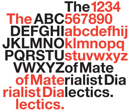
Typography is minimalistic but also amazingly strong. For example, the Helvetica Font is the most widely used font ever, and it has recently become the subject of its own movie.
The appeal for a distinctive, professional and timeless typeface has never dwindled and it keeps gaining more followers day by day. From a designers Point of view, you have to say that Helvetica is more than just a pice of Creation.
From airlines, to car companies to the largest software company, Helvetica’s use in logos throughout the world remains as strong as ever.
Interesting Brands like
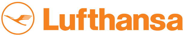
- Lufthansa in Helvetica
- The Lufthansa Logo evolved over the last decades into a more dynamic shape
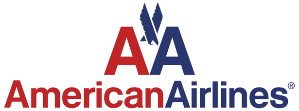
- American Airlines use Helvetica for their Brand
- The AA Logo is very dramatic and clear in its form
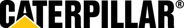
- The US American Company Caterpillar is known for its Heavy machinery. They also chose Helvetica
- The Caterpiller Logo refers to it origin, the caterpillar, but also to the giantic dimensions of the machines
- The Straight spaceing between the letters makes the Logo look hard and tough
- American Apparel is based on the Helvetica Fontfamily
- The relaxed and well done spacing gives feeling of air and High Society

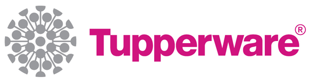
- Tupperware makes use of the light and complex singet and technical Font
- The Logo reflects the Design Guideline for the Tupperwarebrand
- Its nice and cosy, but als well engineerd and straight forward
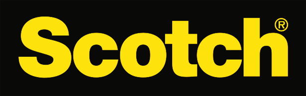
- Scotch is known for its Emergency and Aid Background
- The Logo clearly refers to a Look that originates from Rescue services and Technical Environment
- The spacing around the logo and the colors communicate clearly that there is nothing to spare, or to add
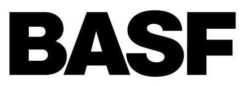
- BASF incoporates all German values. Its straight. Its black. Its white.
- It does what it should do. It looks official, professional, clear and honest
- There is no space for color or motion. Everything is perfectly engineered.
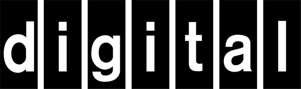
- the digital Logos use Helvetica for their Brand
- Without even reading it you are sure: this is made for machines not for men
- Skype is an other Example how to use Helvetica in a modern way
- The outlined Logo is very playful and fresh
The Trailer video and some extras
Helvetica The Official Trailer
Erik Spiekermann, I’ve met him some years ago in Munich – Extra Interview
